What is the name of your business?
Describe in one sentence your business/service:
If you are not a new business start-up – what are the reasons you want a new logo?
What are your business short term, medium term, and long term goals?
What do you want your new logo to achieve?
Who are your main competitors and how do you differ from them?
What do you like or dislike about your competitor’s branding?
Who are your potential clients?
Where will your business be publicized?
Do you have a specific idea in mind for your logo?
Do you want to use existing brand colors or a particular range of colors?
Are there any colors that you do not want to use?
Do you have a particular font you would like to use – or ones you definitely do not want to use?
What words should describe your logo?
What message or emotion do you want your logo to portray?
Does your logo have a tag line?
Is your tag line to appear with your logo on all of your branding?
Where will your logo be used?
What logos do you like and why?
When do you want your logo to be web/print-ready?
What is your Budget?
Would you like any additional design services alongside your new logo? (e.g., business cards, letterheads, other stationery, social media icons/banners, advertising material, etc.)
Any other comments?

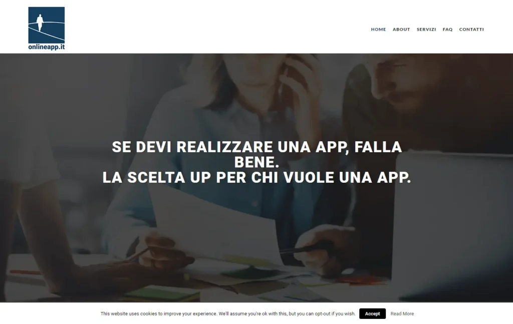
Put them in the wrong order and you might not get any results.
Marketing is a complex and dynamic field that requires careful planning and strategic thinking. I have seen countless businesses struggle with their marketing efforts because they fail to follow a logical and effective approach. One technique that I have found to be particularly useful is the "3Ms of Marketing": Market, Messages, and Medium. By considering these three elements in the right order, businesses can create targeted and impactful marketing communications that yield results.
Let me illustrate the power of the 3Ms technique with a true story. Julie, a jeweler, sought my advice on whether she should invest in a better website or a printed brochure to promote her products. Many workshop participants in similar situations tend to argue for one medium over another based on its versatility or visual appeal. However, Julie's question was misguided. It focused on the medium rather than the market segments and the message. To help her make the right decision, I delved deeper into her business.
Julie had two distinct types of jewelry: fine silver jewelry and brightly colored acrylic jewelry. Each product catered to a different market segment: wealthy middle-aged ladies and teenage girls, respectively. While Julie viewed her business as one integrated entity, her customers perceived it as two different businesses. This realization was crucial.
Applying the 3Ms of Marketing, we first examined the fine silver jewelry. The market was clearly wealthy middle-aged ladies. Next, we crafted a message that would resonate with this audience – words like "elegant," "exclusive," "handmade," "expensive," and "classic." Finally, we determined the most appropriate medium to deliver this message, which led us to glossy lifestyle magazines. These magazines aligned with the customers' preferences and served as a suitable platform to convey the message of elegance.
Moving on to the brightly colored acrylic jewelry, we repeated the 3Ms technique. The target market was teenage girls, and the message centered around words like "fun," "inexpensive," "colorful," and "cool." To reach this audience effectively, we recognized that social media platforms such as Facebook, Twitter, and text messages were the most appropriate mediums.
The 3Ms technique ensures that marketing communications are designed with clarity and precision for each target audience and product. It begins by selecting the target markets, followed by determining the marketing messages specific to each segment. Only then do we consider the most suitable medium or media to convey those messages. This approach leads to focused and impactful marketing strategies.
Many marketing communications go wrong because the medium is decided too early in the process, without considering the target audience and message. Leaflets may be produced without a clear distribution plan or a radio advertisement chosen based on another business's success. By starting with the audience and working backward to the message and medium, we make more informed decisions.
The power of the 3Ms technique lies in its ability to guide businesses toward precise conclusions. Participants in my workshops often find their initial answers to marketing dilemmas significantly different from their final conclusions. By following the 3Ms one step at a time, in a logical order, they arrive at conclusions that make perfect sense for their specific business, products, and target markets.
To optimize your marketing communications, I encourage you to apply the 3Ms technique. Start by reviewing your target markets for each product or service, then define the marketing messages tailored to each segment. Finally, consider the most appropriate medium to convey those messages effectively. By embracing this methodology, you can achieve greater clarity, increase your sales and profits, and make the most of your marketing resources.
Remember, the 3Ms of Marketing – Market, Messages, and Medium – should always be considered in the right order. Put them in the wrong order, and you might not get the results you desire.
Visience is a web design agency from Iași, specialized in creating professional websites, including presentation sites and online stores. Their team of expert web design and development work to create unique and effective websites that are both distinctive, functional and easy to use.
Visience offers quality services for companies in Iasi, including SEO optimization to ensure that your website is easy to find on search engines and attracts quality traffic. They offer customized solutions for your business needs, whether you are a small business or a large company.
The Visience team uses the latest technologies and industry best practices to create a website that is representative and profitable for your business. They emphasize detail and a personalized approach, ensuring that your website is built to help your business grow its online presence and grow its revenue.
In conclusion, if you are looking for a reliable partner when it comes to creating a professional presentation website or online store, Visience is a great choice. Contact them today to discuss your business needs and how they can help you build a strong online presence.
We are the help you needed to go online and reach the right people. We have the complete solution for everyone.
Our Web Design service in Iasi is dedicated to creating professional websites that bring significant benefits to your business. Here are some of the features of our sites:
We offer high-quality design that highlights your company's identity and message. Your website will be attractive, easy to navigate and visually pleasing to users.
Our design is fully responsive and will display correctly on any device, be it desktop, laptop, tablet or mobile. Thus, users will have a perfect user experience on any screen.
The security of your website is a priority for us. We use the most advanced technologies and security measures to protect your site from cyber attacks and other threats.
Your website will be equipped with an intuitive administration panel, on a CMS platform. Thus, you will be able to manage and update your content in an efficient and simple way.
In conclusion, our Web Design service in Iasi is the perfect solution to build a strong online presence and increase your income. We offer high-quality, personalized services with a focus on professional design, site security, and ease of content management. Contact us today for more information on how we can help your business.
Showcase sites are a great way to share information about your services and ideas with the general public in an interactive and attractive way. But how can you promote your showcase site so that more people can benefit from it? Here are 13 creative ways to promote your showcase site and help you reach a wider audience.
1. Make it easy to find: Make sure your showcase site is easy to find by optimizing it for search engines. This means creating keyword-rich, search engine-friendly content, as well as submitting it to directories and making it available on social media.
2. Take advantage of social media: Use social media platforms, such as Facebook, Twitter, Instagram and YouTube to promote your showcase site. Share interesting content related to the topics covered in your presentations and be sure to include a link to your presentation website.
3. Start a blog: Start a blog related to the topics covered in your presentations and create a link to the presentation website. This will create more visibility for your website and help people find it easier.
4. Send emails: Send emails to people in your network and let them know about your showcase site. Include a brief description of the content and a link to the website.
5. Use targeted advertising: Use targeted advertising to reach people who are interested in the topics covered in your presentations. This will help you reach a more targeted audience.
6. Participate in discussion forums: Participate in discussion forums related to the topics covered in your presentations and be sure to include a link to the presentation website.
7. Create a video: Create a video summarizing the main points of your presentation and include a link to your website. This will help people get a better idea of what to expect when they visit the website.
8. Create a press release: Create a press release about the website launch of your presentation and send it to news agencies.
9. Leverage influencers: Find influencers who are interested in your topics covered in your presentations and ask them to share your content and website.
10. Host a webinar: Host a webinar related to the topics covered in your presentations and be sure to include a link to your presentation website.
11. Use banner ads: Use banner ads to promote yourself presentation website. This will help you reach a wider audience and get more people to visit your website.
12. Organize a contest: Organize a contest related to the topics covered in your presentations and be sure to include a link to your presentation website.
13. Offer Incentives: Offer incentives to people who visit your site- the web of your presentation. These can be in the form of discount codes, contest entries or even free products.
By following these 13 creative ways, you will be able to promote your website effectively presentation and reach a larger audience. Good luck!
As an entrepreneur, you know how important it is to be seen and heard online. That's why it's essential to have a strong brand identity that stands out from the competition. Rebranding is a great way to create an improved and refreshed look for your business. Here are five reasons why you should consider rebranding with Visience.
1. Rebranding helps you reach new customers. A successful rebranding can help you reach new clients and customers. With Visience, you can create a unique and memorable brand image that people will associate with your business. This can help you build a strong reputation and attract more people to your business.
2. Rebranding can help you reach new markets. By rebranding with Visience, you can create a brand identity that appeals to customers in new markets. This can help you expand your customer base and make your business more successful.
3. Rebranding can increase your online presence. Rebranding can help you appear higher in search engine results and attract more web traffic. Visience can help you create a modern and professional brand image with SEO keywords and content that will help you increase your visibility.
4. Rebranding helps you refocus your brand. Rebranding can help you refocus your brand and update your brand identity. Visience can help you create a fresh, modern look for your business that will attract more customers and help you stand out from the competition.
5. Rebranding can help you build brand loyalty. With a successful rebranding, you can create a strong brand image that customers will trust and remain loyal to. Visience can help you create a memorable brand identity that will help you secure customer loyalty.
Rebranding with Visience can help you create a strong brand image and memorable that will help you reach new clients, markets and customers. Visience can help you create a brand identity that will help differentiate you from the competition and ensure customer loyalty. So, if you want to rebrand your business, Visience is the perfect choice.
Are you tired of not getting enough traffic to your website? Are you struggling to attract new customers and grow your business? Look no further! Our team of experts provides exceptional website design services, web development, and online marketing services to help your business thrive in today's digital world.
Our Services:
At our Web Development and Online Marketing Company, we are committed to providing exceptional services that exceed your expectations. We work with you to understand your unique needs and create customized strategies to help you achieve your business goals. With our expertise, you can be confident that you are investing in the success of your business.
Contact us now to take advantage of this limited time offer and start growing your business! Call us at +40771486499 or send us an email at visience.ro@gmail.com. We look forward to hearing from you!
In today's world, having a strong online presence is crucial for any business or individual. However, not everyone has access to high-quality images or the budget to hire a professional graphic designer. That's where free image upscaling websites come in handy. In this post, we'll be sharing three websites that can help you enlarge your images for free.
Pixelcut.ai/tools/image-upscaler
Pixelcut is a website creation company that offers a variety of tools to help with online promotion, SEO, market research, and more. Their image upscaler tool is easy to use and produces high-quality results. Simply upload your image and select the desired size, and the tool will enlarge your image while maintaining its quality.
Zyro.com/tools/image-upscaler
Zyro is a web design services company that provides affordable web design services to businesses and individuals. Their image upscaler tool is free to use and produces great results. All you have to do is upload your image and select the desired size, and the tool will do the rest.
Media.io/image-upscaler.html
Media.io is an online promotion platform that offers a variety of tools to help with online promotion, market research, and more. Their image upscaler tool is easy to use and produces high-quality results. Simply upload your image and select the desired size, and the tool will enlarge your image while maintaining its quality.
Whether you're looking to improve your website's design or simply need high-quality images for your online promotion, these free image upscaling websites can come in handy. With just a few clicks, you can enlarge your images and make them look professional.
Flyers are a great way and cost-effective to promote a business, event, or product, and creating them is easier than you might think. However, creating an effective flyer involves more than just making it look good. Practical design is better than beautiful design because it communicates the intended message clearly and effectively.
Creating a flyer is a simple process that can help you reach your target audience and achieve your goals. By following these steps and taking the time to create a well-designed flyer, you can create a powerful marketing tool that will help you promote your business or event.
By following these steps and using one of these online flyer makers, you can create a professional-looking flyer in no time.
In recent years, we've seen a trend towards "Blanding" - simplifying brand logos and designs to make them more approachable and familiar. However, this trend is starting to fade out, as brands realize that a bland and generic look won't help them stand out in a crowded marketplace.

Instead, we're seeing a shift towards a more maximalist approach to branding. This trend has been dubbed "Heritage Maximalism," and it's all about embracing bold aesthetics, ornate designs, and eye-catching logos. Burberry's new logo is a great example of this trend - it's heavier and bolder, with a geometric sans-serif treatment that makes it stand out from the crowd. Gucci has also been embracing this style for a while, with its iconic logo and maximalist designs.
But it's not just high fashion brands that are going maximalist. We're seeing the use of serif fonts, hand-drawn designs, and ornate logos across a wide range of industries. Whether you're a tech company, a consumer goods brand, or anything in between, embracing Heritage Maximalism can help you differentiate yourself from the competition and make a bold statement to potential customers.
So why the shift away from Blanding and towards maximalism? The answer is simple - in a crowded marketplace, it's hard to stand out and make a lasting impression when every brand looks the same. By embracing maximalism, brands can differentiate themselves and create a unique identity that resonates with customers. Whether it's through ornate designs, bold colors, or eye-catching typography, maximalism allows brands to create a visual language that is memorable and distinctive.
Of course, there are legal considerations to take into account when it comes to rebranding. Trademark rights are amassed and maintained through consistent use of a mark, so changing a brand's logo or design could result in complications. However, for those who are willing to take the risk, the reward could be worth it. By embracing Heritage Maximalism and creating a bold, distinctive brand identity, you can stand out in a crowded marketplace and make a lasting impression on potential customers.
So don't be afraid to go big and bold with your branding. Embrace Heritage Maximalism and create a visual language that sets your brand apart from the competition. Your customers will thank you for it.
Heritage Maximalism is not just a fleeting trend in the world of branding; it has deep historical and cultural roots that stretch back to artistic movements and design philosophies from centuries past. To truly understand the power of this approach, it’s important to recognize that maximalism in branding today is a continuation of longstanding traditions that celebrate opulence, craftsmanship, and attention to detail.
The origins of maximalism can be traced back to periods like the Baroque era, where art, architecture, and design were all about grandeur and exuberance. The Baroque style, characterized by intricate details, bold forms, and dramatic contrasts, laid the foundation for an aesthetic that embraced more rather than less. Similarly, movements like Art Deco in the early 20th century revived this love for rich ornamentation with its geometric shapes, bold colors, and lavish materials.
These influences are being revived in contemporary branding because they tap into an inherent human appreciation for beauty, complexity, and history. In a world dominated by sleek minimalism, where many brands start to look indistinguishable, returning to heritage-inspired aesthetics offers a way to stand out while evoking a sense of timelessness and authenticity. It creates a visual identity that feels grounded in the past yet relevant for modern audiences.
Moreover, embracing Heritage Maximalism allows brands to communicate more than just a product or service – they tell a story. When consumers encounter a brand with ornate designs, serif fonts, and rich, layered visuals, they are drawn into a narrative of tradition, craftsmanship, and legacy. This is why we see brands not only in high fashion but also in industries like food, beverages, and even technology adopting maximalist elements that harken back to a sense of place and history.
Take the example of Tiffany & Co., which has used its distinctive blue box and timeless serif logo to evoke luxury and heritage for over a century. More recently, Pendleton Woolen Mills has maintained a commitment to intricate, heritage-inspired patterns that reference Native American designs, underscoring a connection to cultural history. These brands showcase how maximalism can be used not merely to be visually striking but to establish a deeper emotional resonance with consumers by celebrating craftsmanship and cultural significance.
In essence, the rise of Heritage Maximalism is not just about visual appeal; it is a response to the growing desire for authenticity in branding. As consumers increasingly seek brands that stand for something meaningful, maximalism provides the perfect canvas for storytelling – one that is as layered and complex as the identities these companies seek to build.

Coca-Cola is a prime example of a brand that has successfully navigated the delicate balance between heritage and modernity. As one of the most recognizable brands in the world, Coca-Cola has a long history rooted in tradition. Its iconic red-and-white color scheme and flowing Spencerian script logo have remained largely consistent since the late 19th century, embodying a sense of nostalgia and timelessness. However, Coca-Cola has never rested on its laurels; it has continually evolved its visual identity to keep pace with modern tastes and trends.
At the core of Coca-Cola’s branding success is its ability to blend heritage with maximalist design elements. Over the years, the brand has consistently introduced rich, layered visuals that add depth to its identity, particularly through seasonal campaigns, limited-edition packaging, and global marketing initiatives.

A perfect example of Coca-Cola’s maximalist approach can be found in its limited-edition packaging for events such as the Olympics, holiday seasons, and collaborations with artists. During the holidays, Coca-Cola often amplifies its heritage identity with intricate, decorative packaging that features elements like the classic Santa Claus illustration, snowflakes, and hand-drawn winter scenes. These designs evoke a sense of nostalgia while also standing out on shelves with bold, eye-catching visuals. The addition of gold foil, detailed embossing, and playful typography gives the packaging a luxurious, celebratory feel that taps into the emotional significance of shared moments around the holiday table.
Additionally, Coca-Cola’s use of ornate typography in various campaigns further accentuates its maximalist tendencies. Whether it's swirling calligraphy or bold, attention-grabbing type, the brand uses typography not only as a functional element but also as a visual anchor that enhances the emotional appeal of the product.
Beyond packaging, Coca-Cola has embraced maximalist design principles in its advertising and marketing. The brand often uses a layered, collage-like approach in its campaigns, where various elements—such as vintage photos, hand-drawn illustrations, and abstract patterns—are overlaid to create a rich, multi-dimensional visual narrative. This approach is particularly evident in global campaigns that highlight Coca-Cola’s role in bringing people together across cultures. For example, the “Taste the Feeling” campaign featured lush, dynamic visuals that mixed everyday moments with vibrant colors and bold typography, creating a powerful emotional connection with consumers.
In this way, Coca-Cola uses maximalism not just for visual impact but also for storytelling. The complexity and richness of the designs reflect the brand’s long-standing commitment to togetherness, celebration, and shared experiences, making it more than just a soft drink—Coca-Cola becomes a symbol of joy, connection, and heritage.
Coca-Cola’s ability to adapt maximalism for different cultural contexts also sets it apart. The brand’s regional campaigns often incorporate local motifs, hand-drawn designs, and ornate visual elements that resonate with specific audiences. For example, in Asia, Coca-Cola has used intricate calligraphy and symbols associated with luck and prosperity to tap into local traditions. In Latin America, vibrant colors and hand-painted visuals capture the region’s festive spirit.
This adaptability allows Coca-Cola to maintain its global brand identity while also celebrating local heritage, effectively combining the best of both worlds. The result is a brand that feels both universally recognizable and deeply personal, making it resonate with a wide range of audiences across the globe.

Beyond the visual appeal, Heritage Maximalism taps into a powerful psychological and emotional dynamic that minimalist designs often fail to achieve. By embracing rich, intricate designs, bold colors, and detailed typography, brands that adopt this approach create a deeper emotional connection with their audience. This impact is rooted in several key psychological principles that explain why maximalism resonates so strongly with consumers.
One of the most significant emotional effects of maximalist branding is its ability to evoke a sense of trust and stability. In an era where consumers are bombarded with countless choices and fleeting trends, brands that lean into a maximalist design often project a sense of permanence and credibility. The use of detailed, ornate designs conveys a level of care and craftsmanship that signals to the consumer that the brand has invested time and effort into its identity. This sense of heritage and tradition can foster a deep trust, especially in industries where brand reputation is paramount, such as luxury goods, banking, and high-end consumer products.
Brands like Rolex and Louis Vuitton have long capitalized on this principle. Their ornate logos and intricate designs are not just visually appealing but serve as symbols of the brand's long-standing legacy of quality and excellence. This fosters an emotional connection with consumers who seek products that represent more than just functionality—they want a sense of belonging to something timeless and enduring.
Heritage Maximalism excels at tapping into nostalgia, which is a powerful emotional trigger. People tend to associate maximalist designs with the past—whether it’s through the use of serif fonts reminiscent of old printing presses, or hand-drawn illustrations that evoke a pre-digital era. This nostalgic connection helps brands tell a story, creating a sense of continuity between the past and present. For many consumers, this evokes feelings of comfort and familiarity, especially in uncertain times when they crave connection to something stable and enduring.
Consider how Cadbury, the iconic chocolate brand, has maintained its purple packaging and signature serif logo for over a century. The detailed, classic design reinforces the brand's rich history and evokes fond memories of childhood for many consumers. By doing so, Cadbury doesn't just sell chocolate; it offers an emotional experience tied to tradition, comfort, and the joys of the past.
Maximalism is inherently associated with luxury and exclusivity. The rich, ornate designs often used in this approach signal that a product or service is something special, crafted with care, and worthy of admiration. Bold typography, intricate patterns, and gold foil detailing, for example, all work together to create an aura of exclusivity. This visual language resonates strongly with consumers who seek products that offer not just material value but emotional and symbolic significance.
Luxury fashion houses like Versace have long embraced maximalism to create an air of opulence. The brand's lavish, baroque-inspired designs, with their elaborate gold embellishments and intricate motifs, communicate that wearing Versace is more than just wearing clothes—it's about making a bold, exclusive statement. This emotional connection elevates the brand, allowing consumers to feel like they are part of something elite and distinctive.
In a marketplace saturated with minimalist designs, brands that adopt maximalism often stand out because they are visually memorable. Complex designs, bold color palettes, and intricate logos capture the consumer's attention in a way that minimalist designs may not. This increased visibility leads to stronger brand recall, allowing consumers to remember the brand more vividly, even after just a brief interaction.
Moreover, maximalist branding is often more engaging. It invites the viewer to explore the design, discovering new details and appreciating the craftsmanship behind it. This level of engagement helps build a stronger emotional bond between the brand and the consumer, as it feels more like an experience than a simple interaction. Brands like Johnnie Walker have leveraged this principle through their detailed label designs, which often feature intricate illustrations and storytelling elements, creating a sense of discovery and personal connection with the consumer.
At first glance, Maximalism and Minimalism appear to be polar opposites—one embraces bold, ornate designs, while the other champions simplicity and restraint. However, these two approaches are not as mutually exclusive as they may seem. In fact, many brands find success by blending elements of both styles, creating a balanced and effective visual identity. Understanding how these two design philosophies intersect and complement each other can help brands craft more nuanced, engaging aesthetics.
Minimalism is often defined by its principle of "less is more." It emphasizes clean lines, negative space, and a focus on functionality, stripping away unnecessary details to create a streamlined look. Maximalism, on the other hand, follows the ethos of "more is more." It encourages the use of rich patterns, bold colors, and layered visuals to make a statement. While these approaches are inherently different, they share a common goal: to communicate a brand's identity clearly and effectively.
In today’s competitive market, brands often utilize minimalism for practicality—particularly in digital spaces where clarity and speed are essential—while adopting maximalist elements to create emotional depth and visual intrigue. This blending of styles can result in a highly dynamic brand identity that is both memorable and functional.
For example, a tech company might use minimalist designs for its user interface, ensuring a seamless, intuitive experience for customers. However, when it comes to marketing campaigns or product packaging, the same brand might employ maximalist elements, such as bold typography or ornate visuals, to create a more vibrant, engaging presence. This allows the brand to maintain a clean, user-friendly aesthetic in its core operations while leveraging the emotional and visual impact of maximalism in its brand storytelling.
One way to blend minimalism and maximalism effectively is through the strategic use of negative space alongside maximalist ornamentation. Negative space, a key element in minimalism, can help direct attention to key design elements, making intricate details or bold typography stand out even more. By balancing ornate visuals with sufficient breathing room, brands can avoid overwhelming the viewer, allowing them to appreciate the richness of the design without feeling visually cluttered.
Consider the branding of Apple, which is widely associated with minimalism. Apple’s product designs and marketing often feature ample negative space and clean lines. However, Apple has also incorporated maximalist elements in its special editions or promotional materials—such as vibrant, colorful packaging or elaborate in-store displays—that draw the eye and create excitement. The balance between these two approaches ensures that the brand remains iconic and recognizable while still allowing room for creativity and bold expressions.
Another effective strategy is to use minimalism as a foundational framework and layer it with maximalist accents. For instance, a brand can maintain a minimalist overall layout while incorporating maximalist elements in specific areas, such as typography, iconography, or color schemes. This creates a visual hierarchy where maximalist touches highlight key messages or features, without overwhelming the overall design.
Brands like Nike often take this approach in their advertising. Their product images and website layouts are typically minimalist, focusing on the product with little distraction. However, when launching special campaigns, Nike incorporates bold colors, dynamic typography, and powerful imagery to capture attention and evoke emotion. This combination of minimalist structure with maximalist flair ensures that the brand remains functional while still making a powerful impact when needed.
Ultimately, whether a brand leans towards maximalism or minimalism often depends on the context in which the design will be used. Digital platforms, especially mobile-first interfaces, tend to favor minimalist designs for usability and speed. On the other hand, packaging, print materials, and brand experiences lend themselves well to maximalism, where tactile elements, rich visuals, and detailed typography can be fully appreciated.
The ability to switch between these two styles based on context allows brands to remain flexible, adapting their identity to suit both functional needs and emotional storytelling. The beauty of the maximalist-minimalist relationship lies in the fact that it’s not an either/or proposition—brands can seamlessly integrate both approaches to suit their specific goals and mediums.
In conclusion, while Maximalism and Minimalism are often positioned as opposing forces, they can be successfully combined to create a balanced and compelling brand identity. By understanding when and how to use each approach, brands can leverage the best of both worlds: the simplicity and clarity of minimalism, paired with the richness and emotional impact of maximalism.
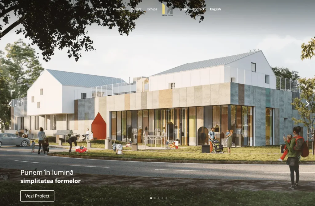
Spune-ne despre proiectul tău. Primești o analiză gratuită a prezenței digitale în maxim 24 de ore. Fără angajamente, fără costuri ascunse.